Borrowing from Interior Design to Build Digital Products (Amalfi-Inspired Example Inside)
✍ Creative Ideas Journal | August 2, 2025
Recently, I have been trying to step away from the computer and move onto non-digital activities in the everyday world. Although I’ve always felt that I lacked an eye for design work, especially regarding interior design, I have primarily worked in office spaces and metal/woodworking workshops. Recently, I’ve been challenging myself to grasp some fundamental interior design concepts.
Although interior design and digital design may seem to differ, I believe that both areas focus on crafting experiences. Interior design might serve as a starting point when I feel creatively stuck by providing me with inspiration through mood, colour, texture, and rhythm, some of these concepts that are also applied to digital content and visual branding. This post will describe how I’ve harnessed interior design genres like Nordic, Amalfi, and Japandi to create visual identities, colour swatches, and font hierarchies—and how you can, too.
Why Interior Design Can Spark the Creative Inspiration
I’ve always believed that creativity doesn’t come from a vacuum. From an industrial design perspective, many of Braun’s iconic works have influenced Apple’s product designs, demonstrating how new ideas often evolve from existing ones (source). This concept of “evolving design patterns” can also be applied to interior design. By observing the world around us and bringing those insights into our interiors, we create spaces that feel more intentional and connected. Rooms are among the most immediate, tactile, and emotionally rich environments in which we interact daily. The lighting and colour of a space, the layout of a kitchen, or even the texture of a floor can shape how we feel. Why shouldn’t those same feelings be integral to our branding and visual storytelling?
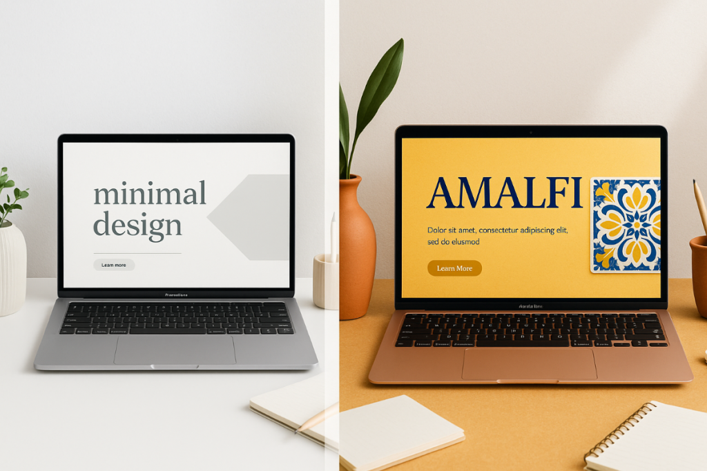
Just like a well-designed living space uses colour, texture, and spacing to create a cohesive look, a digital product should apply the same principles. When I start a new design for a printable, a branding project, or even a blog post layout, I focus on translating elements like colour palettes, font pairings, and spacing into a clear, consistent style. For example, a Nordic-inspired design might feature clean lines, muted tones, and ample white space. At the same time, an Amalfi-themed project could lean into vibrant blues, sun-washed yellows, and textured backgrounds that evoke the essence of coastal living. This approach makes it easier to define the project’s overall look from the outset.
Identifying Interior Design Genres
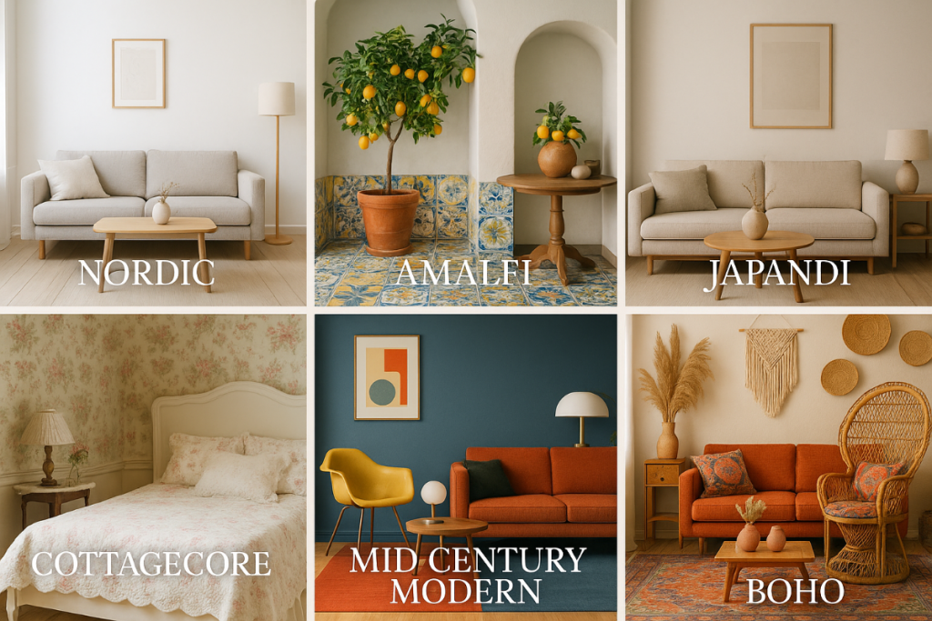
There are dozens of interior design genres, each with its own unique personality. Here’s a breakdown of some of the most impactful styles that have guided my creative work:
- Nordic / Scandinavian: Simplicity, functionality, and minimalism. White walls, natural wood, clean lines.
- Amalfi / Mediterranean: Sun-drenched, vibrant, rustic charm. Cobalt blue tiles, lemons, and sandy textures.
- Japandi: A hybrid of Japanese and Scandinavian — muted, balanced, serene.
- Mid-Century Modern: Retro shapes, warm woods, bold accents.
- Cottagecore: Cozy, romantic, and floral-heavy — a nostalgic, lived-in vibe.
- Industrial / Urban Loft: Exposed materials like brick and metal — excellent for minimalist or edgy styles.
- Bohemian (Boho): Eclectic, colourful, relaxed, and free-spirited.
From Moodboard to Swatch: Translating Interiors into Colour Palettes
Interior design genres often rely on specific colour palettes to create a cohesive look, and these palettes are just as valuable for digital design. Each style offers a ready-made set of tones that can define the overall feel of a project.
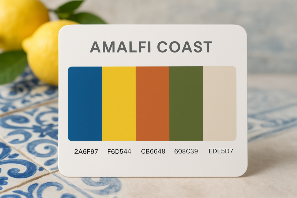
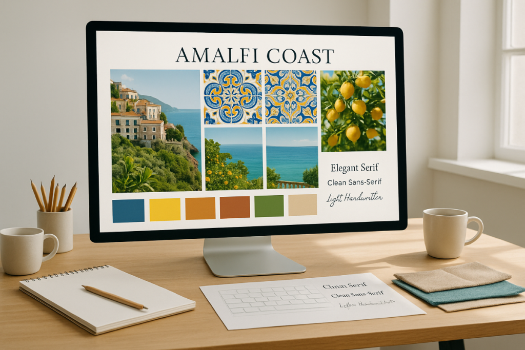
When I began designing my Amalfi-themed printable series, I studied images of the region’s coastlines, architecture, ceramics, and citrus groves. From those references, I created a colour swatch that became the foundation of the entire collection:
- Amalfi Blue
- Lemon Yellow
- Whitewashed Sand
- Terracotta Clay
- Olive Green
This swatch guided every visual decision, from backgrounds to accent details. Using a defined palette ensures consistency and prevents designs from feeling scattered. For example, a Nordic-inspired palette might feature muted greys, soft whites, and pale wood tones for a clean and minimal look. At the same time, Amalfi’s colours are vibrant and sun-drenched, instantly evoking Mediterranean charm.
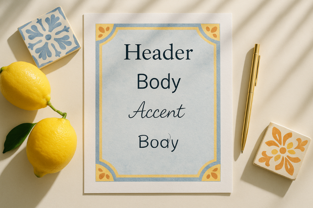
Creating Font Hierarchies That Reflect Style
Fonts, like colour palettes, set the tone for a design. The right pairings can bring structure and personality, while mismatched fonts can make a project feel disconnected. A clear font hierarchy—defining which fonts are used for headings, body text, and accents—ensures consistency across every element.
When designing my Amalfi-themed printables, I selected fonts that matched the vibrant yet relaxed Mediterranean look:
- Header font: A soft serif with a touch of elegance (e.g., Cormorant Garamond)
- Body font: A clean, readable sans-serif (e.g., Lato)
- Accent font: A handwritten or script style for small highlights (e.g., Dancing Script)
This combination mirrors the balance found in Amalfi’s interior style—structured but never rigid. By contrast, a Nordic-inspired design might lean on minimalist, geometric fonts like Montserrat or Open Sans, paired with plenty of white space to reinforce its clean, understated aesthetic.
Limiting yourself to no more than three fonts (heading, body, and accent) helps maintain cohesion and keeps the design from feeling cluttered. Just like in interior design, less is often more.
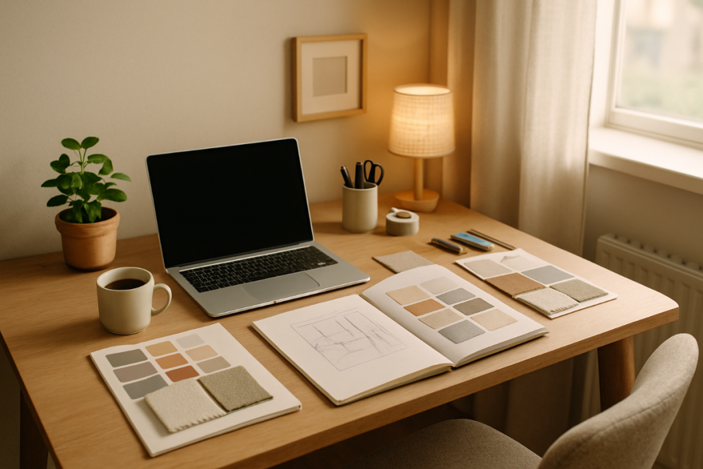
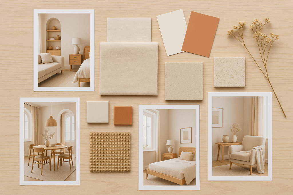
From Physical to Digital: Moodboarding Your Project
Interior designers instinctively create moodboards to define the look and feel of a space before making any decisions. This same process works perfectly in digital design. By gathering visuals and organizing them into a moodboard, you can establish the colour palettes, font choices, and overall style that will guide your project.
Here’s how I approach it:
- Collect 5–10 inspirational images from sources like Pinterest or Instagram. For example, when working on an Amalfi-inspired project, I draw inspiration from photos of Mediterranean architecture, coastal views, and vibrant ceramic tiles. A Nordic-themed design might instead focus on bright white rooms, soft grey textiles, and pale wood finishes.
- Extract a colour palette using a colour picker tool. These swatches serve as the foundation of your project, ensuring that every design element ties back to the chosen style.
- Select 2–3 fonts that match the aesthetic. For Amalfi, I use warm, classic serifs balanced by clean sans-serifs. For Nordic, I lean into minimalist, geometric typefaces with plenty of spacing.
- Roughly map out your design layout—just like furniture placement in a room. Determine where key elements, such as headings, images, and content sections, will be placed to ensure the design feels cohesive.
A well-designed mood board serves as your style guide. It keeps all decisions—colours, fonts, and layouts—consistent, so the final product looks intentional rather than pieced together.
Why Amalfi? A Personal Note
Of all the interior design genres I’ve explored, Amalfi seemed to be the latest trending design and I wanted to translate it into digital projects. Its style is recognizable with the vibrant blues, sun-washed yellows, textured tiles, and natural materials that evoke the Mediterranean coastline.
When I created my Amalfi-themed printable collection, I wanted to capture that same look and feel in a way that felt cohesive. The colour palette became the foundation: Amalfi Blue for headings, botanical artwork. Fonts were chosen to reflect a balance of structure and warmth—a classic serif for headers paired with a clean, modern sans-serif for body text.
This combination gave the designs a fresh yet timeless look, mirroring the qualities of Amalfi interiors. Just as a Mediterranean home balances rustic details with elegant finishes, the collection brought together texture, colour, and typography in a way that felt complete.
How You Can Apply These Ideas to Your Own Projects
You don’t have to be an interior designer to use these techniques. Whether you’re working on a printable, a blog layout, social media templates, or even a complete brand refresh, the same process applies: define a style and use it consistently.
Here’s how to start:
- Choose a design genre that resonates with your project’s purpose. For instance, a Nordic-inspired style, characterized by muted tones, clean lines, and minimalist fonts, works well for projects that require a calm, understated look. Amalfi, on the other hand, is perfect for designs that should feel vibrant and full of life, thanks to its bold blues, sunny yellows, and textured details.
- Build a colour palette using 4–6 colours that reflect the genre. Stick to it—this is what keeps your design cohesive.
- Select 2–3 fonts that complement each other and match the overall aesthetic. Avoid using too many different styles; consistency is key.
- Plan your layout before you start designing. Think of it like arranging a room: where will the main elements (headings, images, content blocks) live, and how will they interact?
Once you have these pieces in place, your design decisions become much simpler. Instead of starting from scratch each time, you’re working from a style framework that ensures everything looks connected and polished.
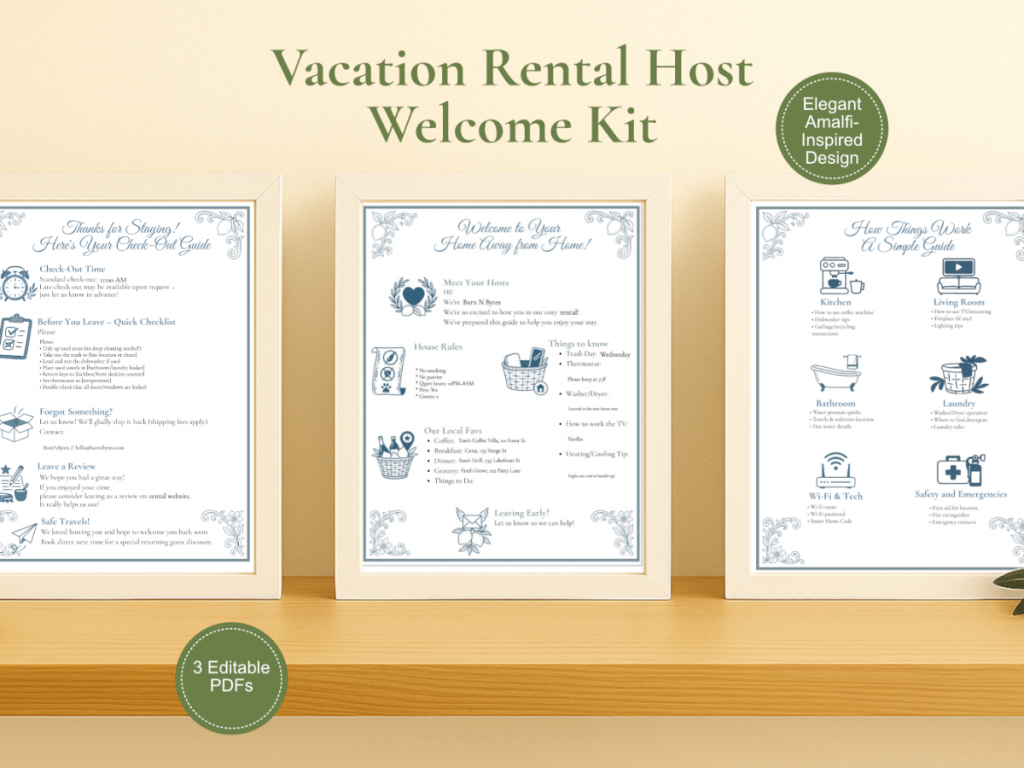
See It in Action: The Amalfi-Inspired Printable Set
Curious how all these design principles come together in a finished product? I put them to the test with a single Amalfi-inspired printable set, drawing directly from Mediterranean colour palettes, font pairings, and layout techniques.
The result is a bright, breezy, and highly organized printable bundle designed with the same approach outlined in this post. You can check it out here:
Final Thoughts: Design Inspiration Is Everywhere
Design doesn’t have to start from scratch. By borrowing principles from interior design—colour palettes, font pairings, and layout frameworks—you can create digital projects that feel intentional and cohesive from the very first draft.
The Amalfi-inspired printable set I shared is just one example of how a clear style direction can shape the final product. By drawing on Mediterranean blues, sunny yellows, and balanced typography, the design came together seamlessly, capturing the essence of Amalfi interiors.
The same approach works for any style you’re drawn to. Whether it’s the clean minimalism of Nordic design or the layered, eclectic feel of Boho interiors, each genre offers a roadmap for your creative process. Look at the spaces and styles that inspire you, build a palette and font hierarchy from them, and let those choices guide every step of your project.
Design inspiration is everywhere—you just need to notice it.